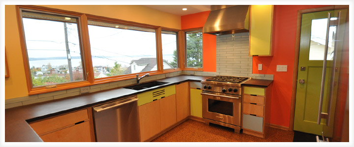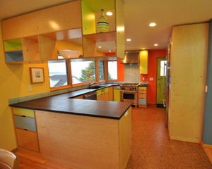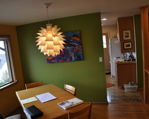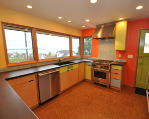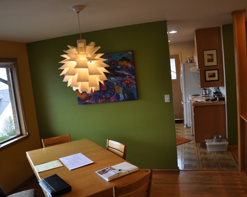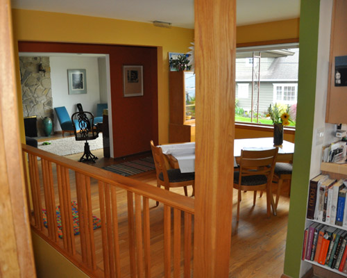
By removing the wall, relocating windows and the door, and installing colorful, environmentally friendly finishes, this remodel creates a truly open floor plan, better circulation, and an improved view.

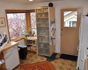
Before: a wall divides the kitchen from the rest of the house and blocks light.

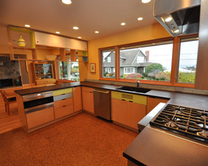
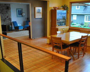
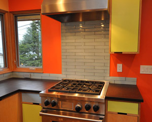
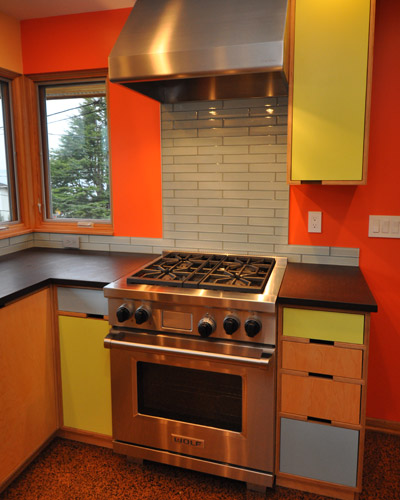
Making the sill height consistent at the windows makes all the difference. The new backsplash is a scant 4 inches to maximize window size and take in all the views and light.

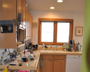
Before: poor window placement blocked the view and a low sill height made for a dead corner—difficult to use effectively. Extensive masonry work was required to correct these problems.

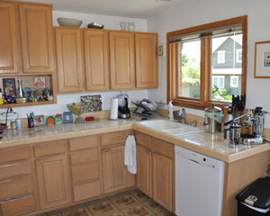
Before: the dividing wall was big on cabinet space but not great on design, with the kitchen sink wedged into the corner.

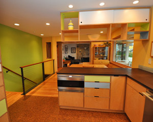
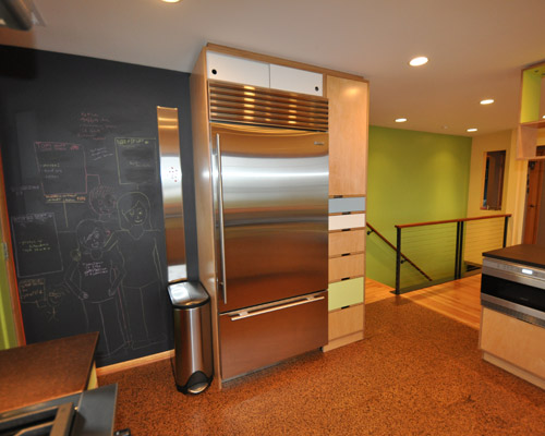
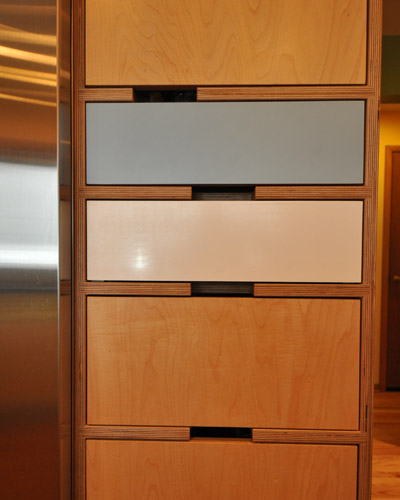
Now a Wolf drawer microwave has a home on the peninsula and a Subzero fridge is all on its own with floor to ceiling cabinetry for company.

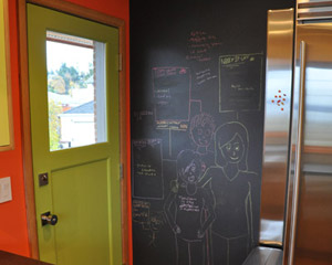
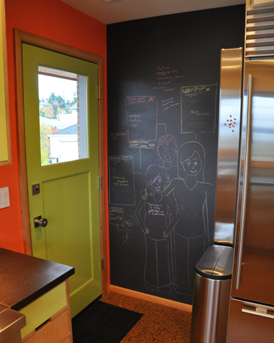
The door to the side yard is relocated into the corner, leaving an open wall for a message center and plenty of space for the Subzero fridge and floor-to-ceiling pantry storage.

Chalkboard paint makes this easy, and the wall has a bonus too: a magnet board. With stainless appliances, there was nowhere to hang magnets. This solves that problem stylishly.

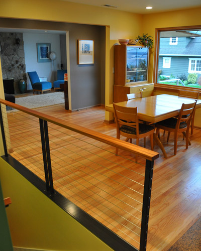
Before: The previous remodel included an oak railing and post--materials and design completely at odds with this mid-century rambler.

It all goes away, replaced with stainless steel stringer railings topped with a mahogany cap and handrail. The wood matches the existing millwork and doors beautifully.

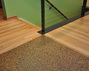
The base of the railings is a steel plate 6 inch wide. It was a perfect and symmetrical solution for bringing together the new cork flooring in the kitchen with the adjacent red oak. There wasn't a simple way to break up the flooring, so having it converge on the steel point worked perfectly. The cork floors and a number of the materials used in the project were chosen for their sustainability.

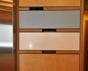
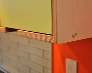
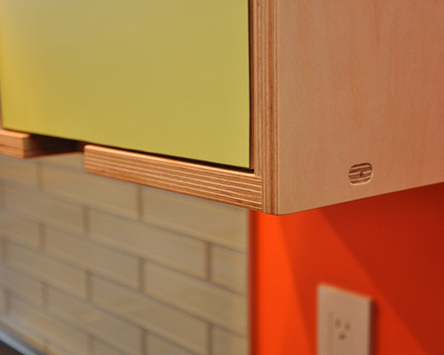
The clients chose Kerf cabinets after buying a coffee table from the company and loving the color and exposed plywood edges.

The cabinets are low VOC with formaldehyde-free plywood that is FSC certified. That's a welcome bonus with this contemporary design.

The clear centerpiece of the kitchen, though, is the Wolf range, particularly because it is visible from all the common rooms. The stainless hood anchors it along with a small upper cabinet. There was talk of using a stainless backsplash, but the clients opted for more of the glass backsplash tile instead. Epoxy grout was used to make it as easy to clean as possible.

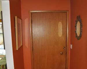
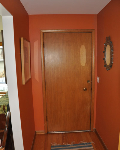
Before: the entry door is delaminating and in need of an update.

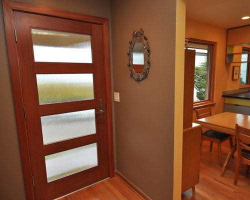
The new mahogany door has reed glass and clean lines, providing privacy while bringing in light to another otherwise dark entry.

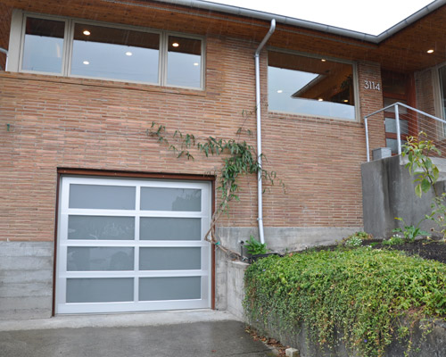
Outside, the old wood garage is replaced with a new frosted glass and aluminum framed beauty. The fussy black wrought iron railings at the front porch are removed in favor of new stainless stringer railings.

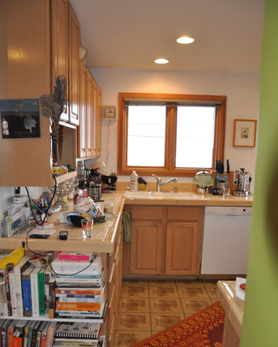
Before: endemic clutter, a mish-mash of patterns and materials.

After: clean lines, green materials, and brightly painted walls. A unique and playful mid-century modern kitchen.
